The case described below is my take on a mobile app for creating travel itineraries.
Problem statement
Tourism industry is constantly on the rise (with projected growth of 3.47%, according to Statista.com), but with soaring prices and limited offering in high season, travelling has become a source of significant stress to many.
Early research
The goal of this project was to check how to eliminate this stress and help people plan and organize their holidays efficiently.
This phase covered both: unstructured conversations with 5 persons, supported by desk research, including travel forums on the Internet, to discover how people plan their journeys.
Main findings:
- All of the interviewees preferred to organize the trips by themselves. The main argument was that traveling with an agency provides a less enjoyable and personal experience.
- All of the interviewees planned their trips in advance, but their reasons for doing so and the timeframe from planning to travel differed. The same was visible on travel forums, where people admitted to be planning up to 3-6 months in advance for long-haul flights and longer stays (2 weeks or longer).
- Interviewees mentioned: choosing destination, buying plane tickets and booking accomodation as their main focus when planning in advance. Only 1 interviewee mentioned making a detailed step by step plan for a trip.
- 4 interviewees occasionally planned their travels are around a particular event such as running competition or a concert.
Pain points:
- Users find it difficult to gather all the notes and confirmations from different emails, calendars, etc. made months before.
- Users lack overview of the trips they planned and use different methods (paper, spreadsheets, memory) to track them.
- Users who plan several trips in advance have a mental burden of remembering what happens when
- Users forget some of the original ideas of things to do and see during the period preceeding the trip.
Solution
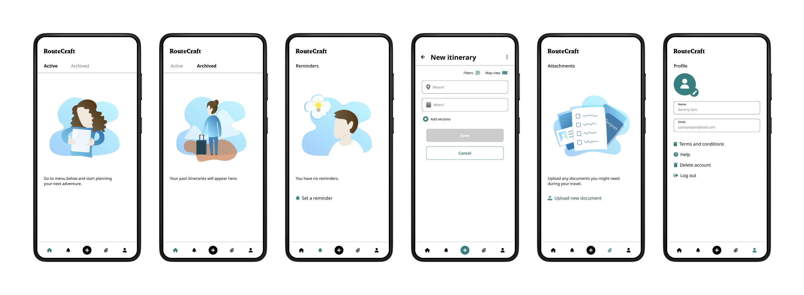
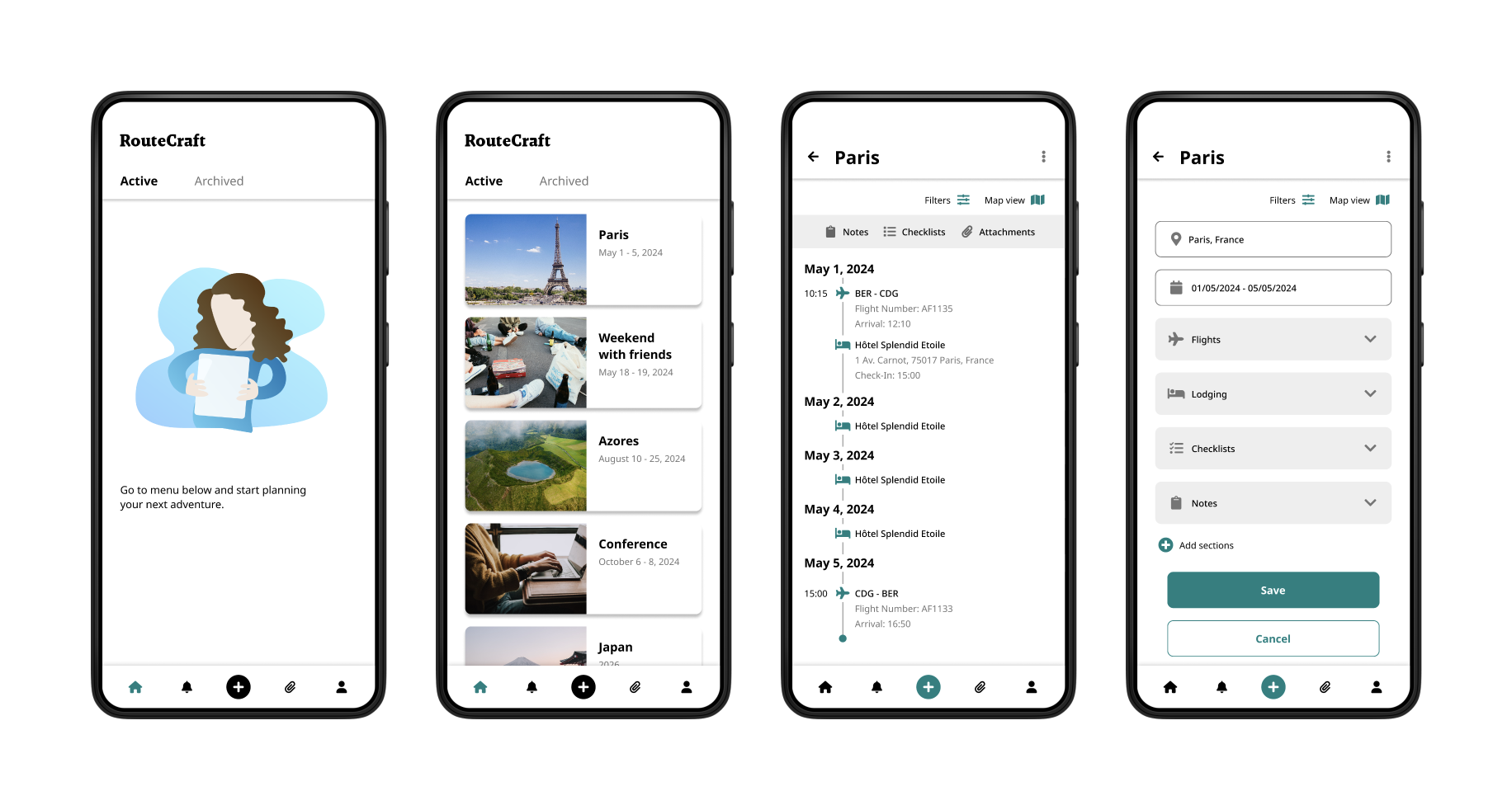
A mobile app for creating itineraries and storing relevant documents.
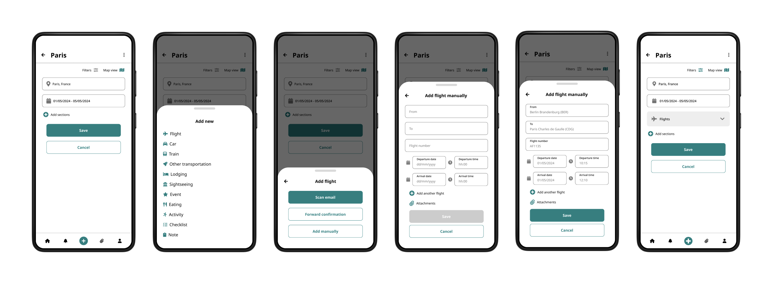
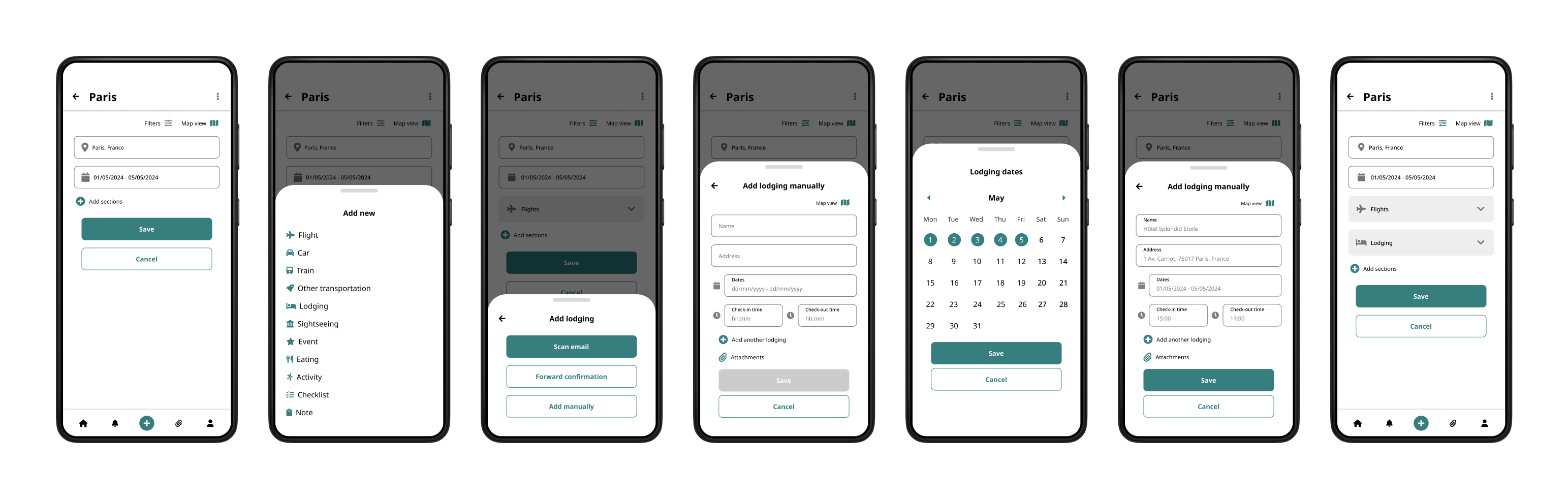
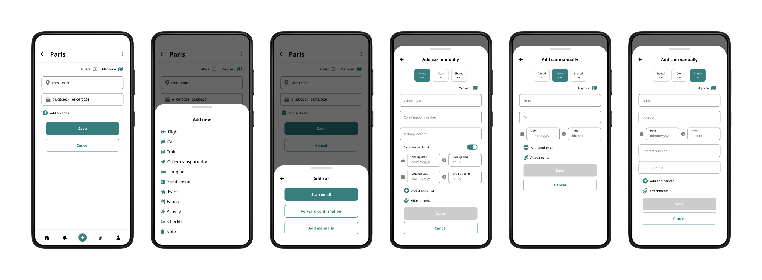
The app should allow the users to add the elements of their travel and see them on the timeline, without getting overwhelmed.
The main focus should be on transportation and lodging, however since some travels are built around particular events, users should also be able to add those to their itineraries.
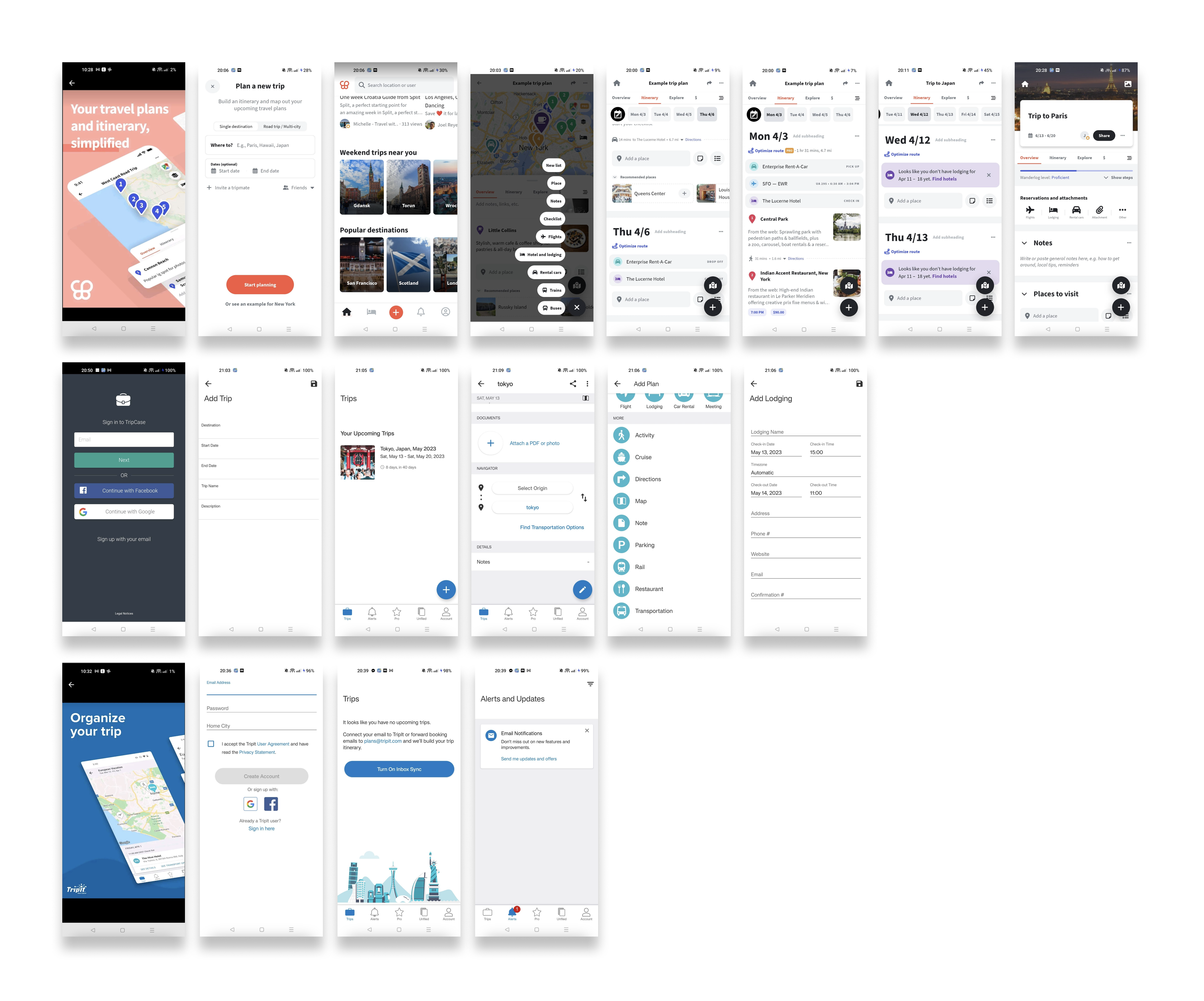
Competitors’ analysis
While there are several similar apps in the market, the most interesting one seems to be Wanderlog. This is a pretty comprehensive app, with an appealing design and robust features.
At the same time, the interface of the app is at times chaotic and app’s multiple features makes it sometimes difficult to use, especially for someone not interested in having a step-by-step travel plan.
The other two apps: TripIt and TripCase provide very opposite experience, with hard to use and somehow outdated interfaces.
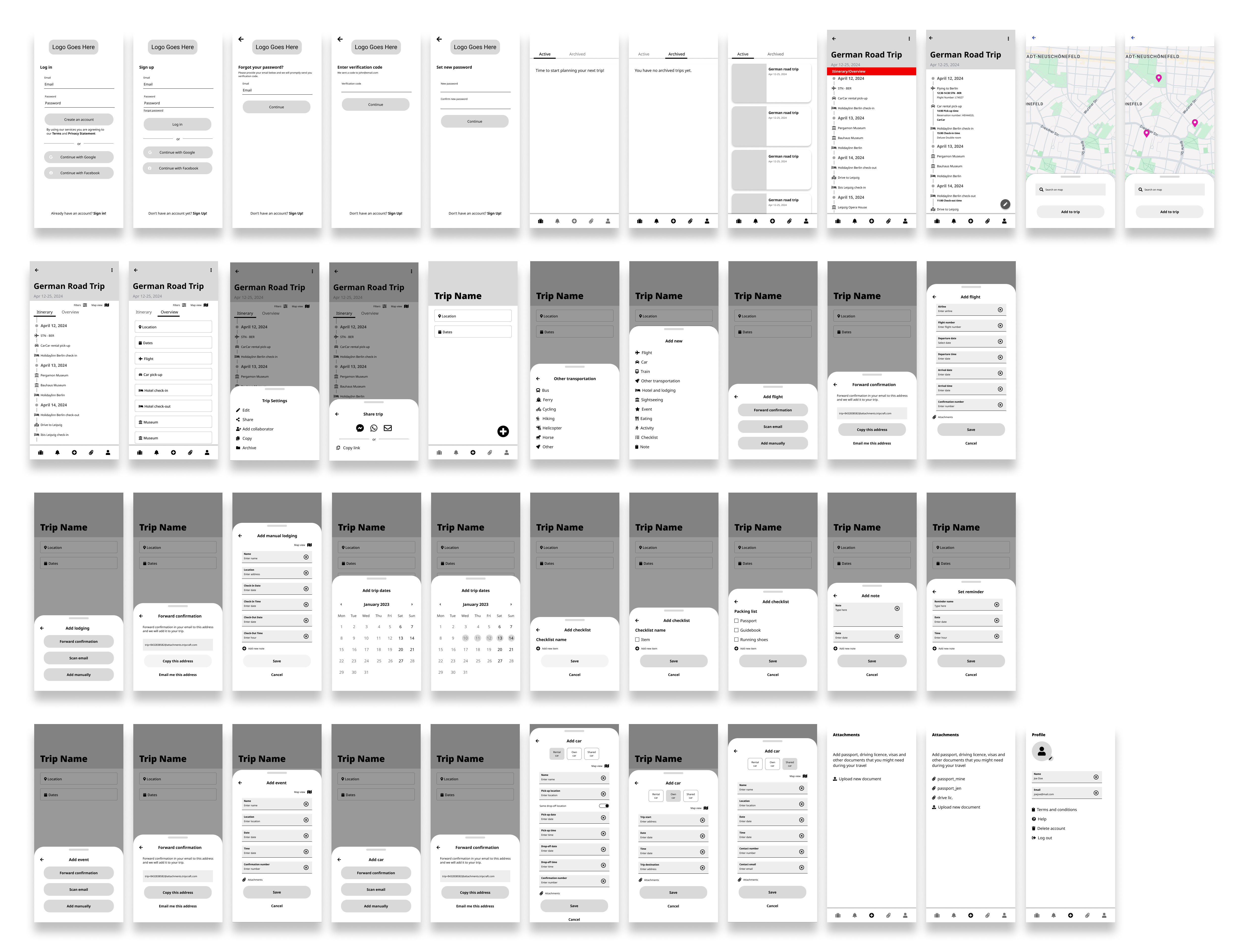
Wireframing
In this phase, I created all the main screens, necessary for the basic features that were revealed in the research.
Main issues during this phase:
- Laying out the elements so that the menus and lists remain clean and easy to navigate.
- Ordering items in the menus – here it would be worth to have an additional round of card sorting with the users to discover the preferences.
- Designing forms for manual entries – it was difficult to strike the balance between simplicity and flexibility, to allow users to enter as little or as many details as they want to. Some of this complexity could be solved by auto-completing data for the users (e.g. hotel’s full address and check-in/check-out times).
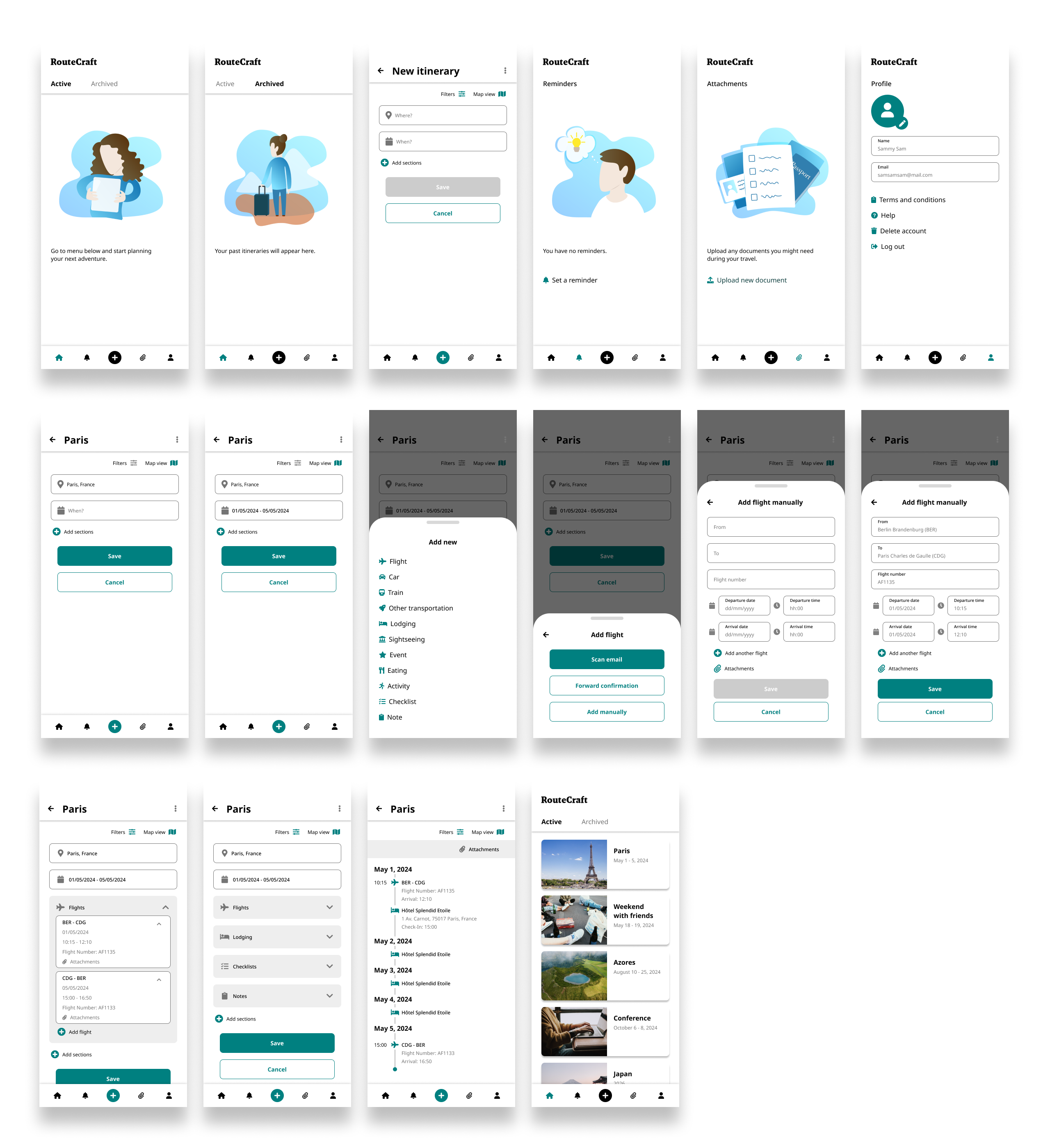
Hi-Fi mockups and taking a step back
Moving on to HI-FI mockups, I added original illustrations and colors, as more detailed screens, needed to complete the interactions. It was also at this stage that the entire design was double checked for accessibility, to make sure that the app can be used by all of its intended users.
Main issues during this phase:
- Color palette that I initially selected for the project turned out to look too heavy once applied to all the screens.
- Some of the screens needed redesign to improve the interactions (e.g. form for adding the lodging manually).
- Decisions where necessary as too how deep to go into the details of the design (e.g. I decided to prepare the view for different types of car journey, but not for the train).
Before:
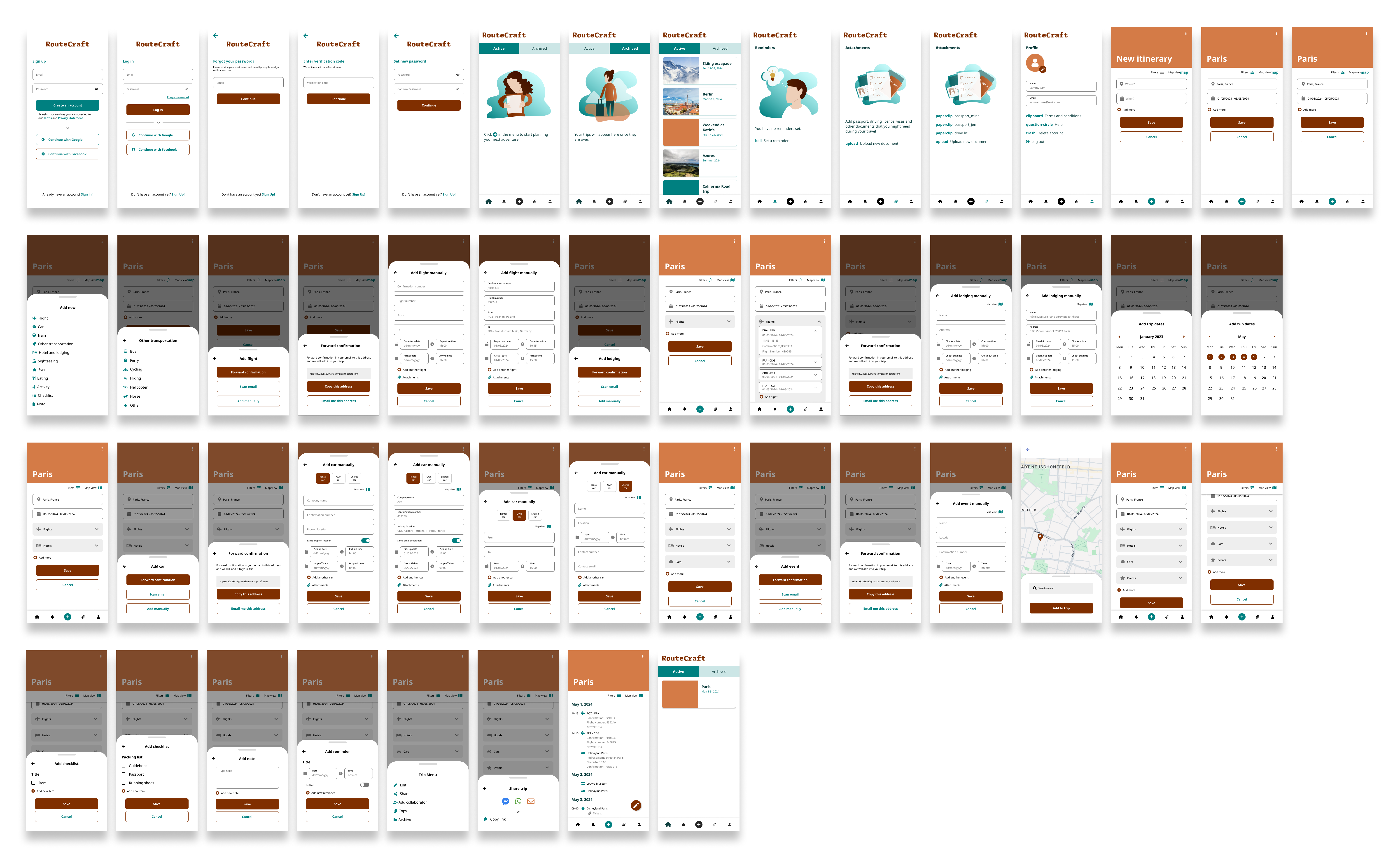
After:
Prototyping
In this stage I created a working prototype of the app. This allowed me to check how the app “feels” on the actual device and find the unresolved gaps in interactions that required additional polishing.
The prototype can also be used to check the usability and desirability of the solution with the users during the testing phase.
User testing
Due to the experimental nature of this project and limited resources, I decided not to continue to the user testing phase and leave it at the prototype stage (at least for now). This of course would be a blocker in a real world scenario and if the app was to ever be actually commercialized.
Conclusion and next steps
Working on this project was entertaining, but not free of challenges. Trying to strike the right balance between forms simplicity and leaving the users freedom to provide detailed information was one of them. Not working with a development team or being able to consult technical issues was the other. Some pivoting was also needed regarding the visual layer, as the initial design seemed too heavy.
Naturally since there were no actual user tests, it’s hard to say that this project is truly finished, so doing the proper user testing would be a natural next step.
It seems that I was able to address all the initial research findings, but I’m genuinely curious to find whether the users would consider that this design goes into the right direction and how could this app be improved.
As with any project, this is an iterative process. Should I revisit this app in the future, I’ll be sure to publish any further discoveries here.